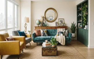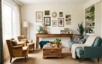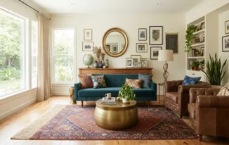

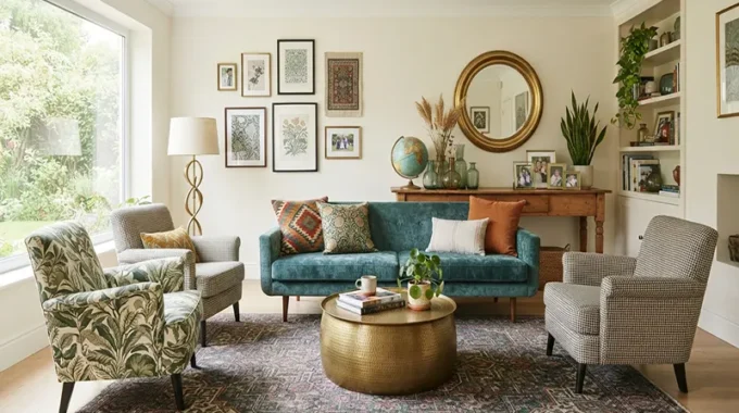
Pattern mixing is the ultimate design superpower of eclectic interior styling. When done right, combining multiple prints creates a space that feels deeply rich, layered, narrative-driven, and alive. However, when done poorly, it can quickly cross the line from a curated bohemian sanctuary into a dizzying, chaotic visual nightmare.
The secret that separates professional interior stylists from amateurs isn’t a fear of bold prints—it is an understanding of composition, scale, and balance. Mastering the art of pattern-clashing allows you to bring disparate eras and textiles together harmoniously. Here are the essential rules for mixing patterns like a pro in your eclectic home.
1. Varying Scale: The Golden Rule of Proportions
The single biggest mistake people make when mixing patterns is choosing prints of the exact same size. When patterns compete on the same scale, the human eye gets confused, resulting in visual vibration.
- The Three-Scale Hierarchy: Every pattern-rich vignette should feature a healthy mix of three scales:
- Large-Scale Prints: Dramatic florals, oversized ikats, or bold geometric murals. Use these sparingly for anchor pieces like statement armchairs, living room rugs, or a single accent wall.
- Medium-Scale Prints: Classic stripes, broad checks, or medium-sized paisleys. These act as the bridge between large and small prints, often used on curtains, throw blankets, or secondary upholstered pieces.
- Small-Scale Prints: Ditsy florals, micro-dots, houndstooth, or subtle textural weaves. These function almost like solids from a distance and are perfect for throw pillows or lampshades.
2. Establishing a Unified Color Anchor
You can mix prints from entirely different centuries and cultures—from Moroccan Berber rugs to English chintz—as long as they share one critical element: a cohesive color palette.
- The Thread of Continuity: Choose a tight color family of three to four tones (such as olive green, warm terracotta, and cream) to anchor your room. If every pattern in the space incorporates at least one or two shades from that shared palette, disparate designs will instantly look like they belong together.
- Concrete Example: Imagine pairing a bold black-and-white animal print armchair with a terracotta-and-cream striped rug and a floral pillow containing hints of both terracotta and black. Because the colors echo one another, the prints converse rather than clash.
3. Balancing Geometric and Organic Motifs
To keep an eclectic room visually balanced, you must mix mathematical structure with free-flowing nature. Too many straight lines feel cold; too many organic shapes feel messy.
- Geometric Structures: Incorporate structured, man-made patterns like grids, tartans, chevrons, stripes, or Moroccan tiles. These provide architectural rigor and stability to a room.
- Organic Motifs: Soften those sharp angles with fluid, natural designs such as trailing botanicals, hand-drawn brushstrokes, animal prints, or abstract water-color florals.
- The Balancing Act: If your rug features a rigid, geometric Moroccan diamond pattern, pair it with soft, organic floral drapes or a swirling, abstract art piece on the wall.
4. Spreading the Weight: Distribution Across the Room
Pattern placement requires strategic distribution. If you cluster all your boldest prints in one corner of the living room, the space will feel visually lopsided and exhausting to look at.
- Diagonal Balancing: Spread patterns across different eye-levels and zones. If you have a statement patterned rug on the floor, balance it with a patterned throw blanket over the sofa or patterned art on the opposite wall.
- The Rule of Three: Limit your major pattern statements in a single zone to about three distinct prints. Let secondary items (like plain linen cushions or solid wood furniture) give the eye a place to rest before encountering the next print.
5. Grounding the Chaos with Solid Neutrals
Negative space is just as important as the patterns themselves. Without solid “breathing room,” even the most thoughtfully curated patterns will lose their impact.
- Solid Neutral Anchors: Use solid-colored walls, large wood-plank floors, plain linen sofas, or unadorned leather accent chairs to ground your patterns.
- The Framing Effect: Think of solid neutrals as the matting around a piece of fine art. A bold leopard-print pillow looks infinitely more luxurious when placed against a crisp, solid oatmeal-colored linen sofa than it does piled on top of a patterned floral couch.
Pattern-Mixing Checklist
Mixing patterns in eclectic home decoration is an intuitive, deeply rewarding creative journey. By respecting scale hierarchies, anchoring your designs with a tight color palette, and balancing geometry with organic movement, you can build a layered space that tells a magnificent visual story.
3 Golden Rules for Fearless Pattern Mixing:
- Never Match Scales: Always combine large, medium, and small prints to prevent visual competition.
- Anchor with Color: Ensure every pattern shares a common color thread to tie diverse cultural or historic prints together.
- Embrace Negative Space: Use solid neutrals and plain textures to give the eye a place to rest amid bold patterns.